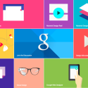
Google heralded a new version of Android at its I/O event in San Francisco last week. The Android version 5.0 is dubbed as ‘L’ for now. Google announced a new universal design language, called Material Design, as part of this Operating System.
Material Design pares back the user interface to a much cleaner, slicker UI. Developers will be able to assign an elevation value for each aspect of their app interface, and Google provides a framework for rendering with virtual light sources and real-time shadows.
Google describes the new design as being “inspired by the study of paper and ink, yet technologically advanced and open to imagination and magic.” The new design language offers many new options for developers by animating almost every transition. According to Google, Material Design organizes interactions and makes better use of space, serving different views of the same content when viewed on a smart phone, tablet or desktop. Some of the key features of the new design include an updated version of the system font, Roboto, as well as bold and dramatic colors and highly polished animations. The whole idea of Google is to have one design to rule them all, well technically one design for every platform.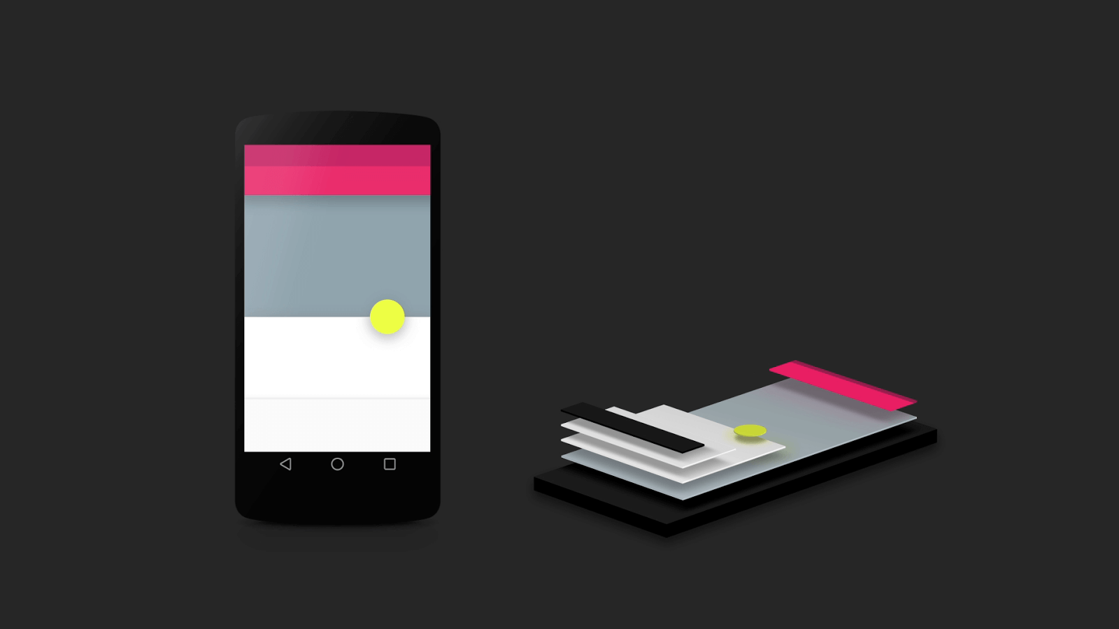
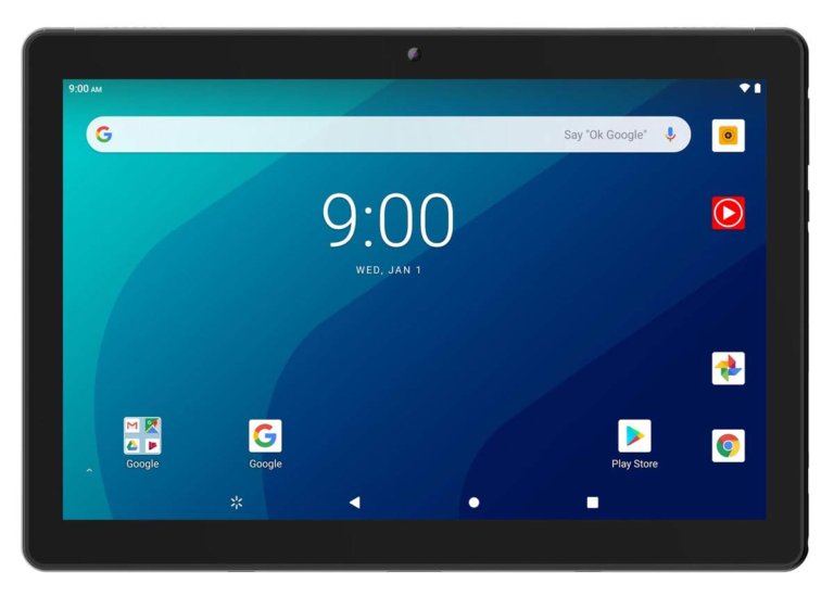
New Google Now cards were also revealed and one of the most significant things is depth which will allow 3D animations. Among the things redesigned include a new navigation bar that has button that resemble a PlayStation controller with a triangle, circle and square. Check out all the user interface changes on Android L.
All of Google’s own apps, including those for Chrome OS, will be updated to Material Design over the coming months. It’s a bold move from Google after so many iterations of Android.

