

A very big release was expected for Android at Google IO 2014, the biggest release yet was the new revamped user interface for Android L. Android L bring material design which gives a much clear information about the UI elements with elevation with control of the z-axis for the developers. There are a lot of User Interface changes that has been made to the latest version of the Android.
This update from Google makes the ecosystem mature with consistent user experience across the multiple devices. Let us take a look at the significant User Interface changes that Google demoed with the Android L developer preview.
System Icons refresh
![]()
The system icons look a lot better and user friendly. The icons suggest what they intend to do clearly. They’ve become a lot more simpler than ever before.
Homescreen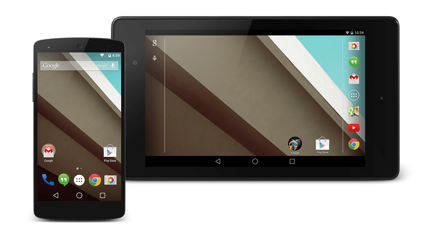
The things you’ll notice with the new Android L homescreen is that the navigation buttons have been changed to triangle, circle and square much similar to the ones you would see on a game controller. The major design change has been with the material design where the UI elements have shadows and perspective to give a 3D look.
Lockscreen
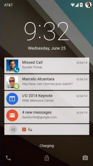
The lock screen now has notifications right on top much like on the iOS. Gestures can be used to interact with the notifications. The Android L can automatically determine if there is a connected smartwatch around to allow you to unlock automatically.
New settings app

The new settings app uses some new system icons and with updated toggles and switches.
New Google keyboard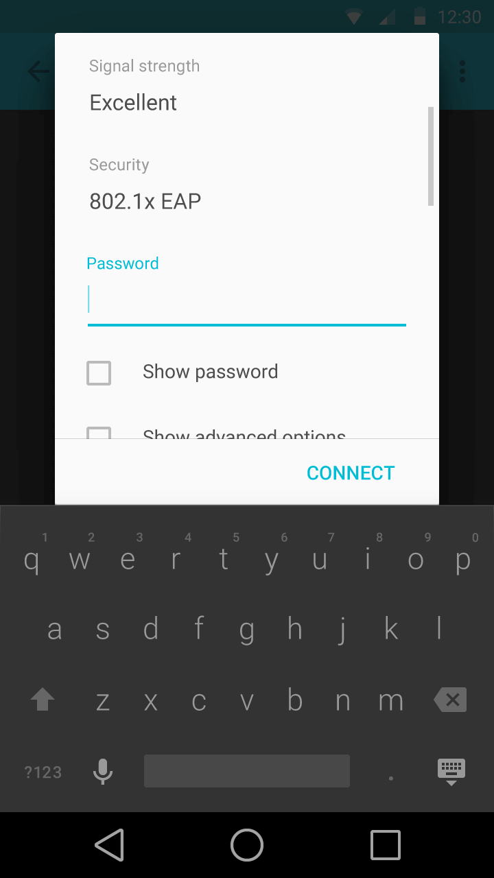
The Keyboard has been changed a lot, starting with dropping of the separators which was popularly seen with Swiftkey themes. It’s usually pretty hard to type on a keyboard without proper separators to allow users to judge the finger placement.
Google Keep
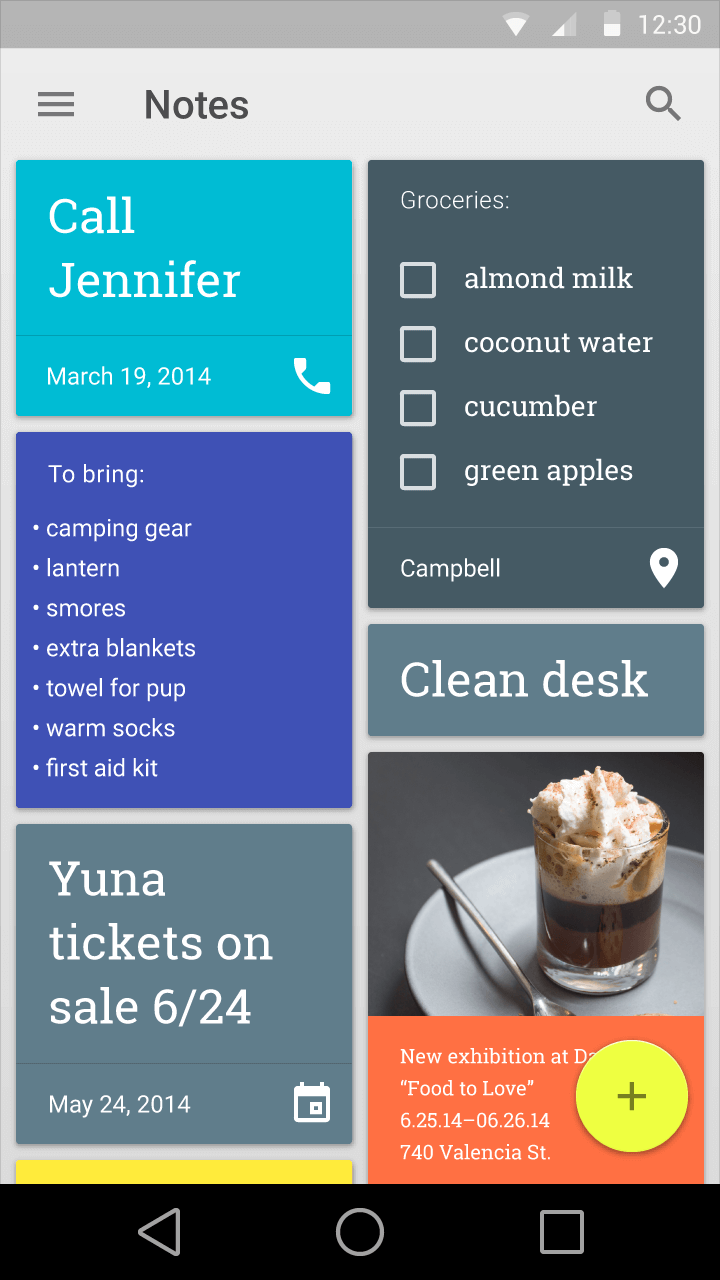
Google Keep has been updated with different colors for different notes with a soft shadow around the corners which was seen in the Material Design video during Google I/O 2014.
New Gallery app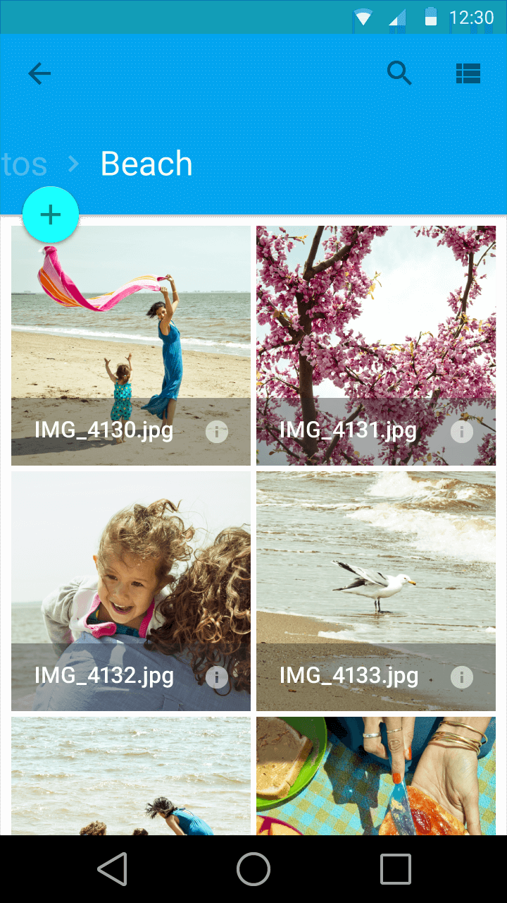
The new gallery app was shown during the Google IO 2014 but it’s not entirely sure if it’s going to be a separate application or an update to the photos app with is deeply integrated with Google+ and it’s awesome photo editing tools.
Contacts
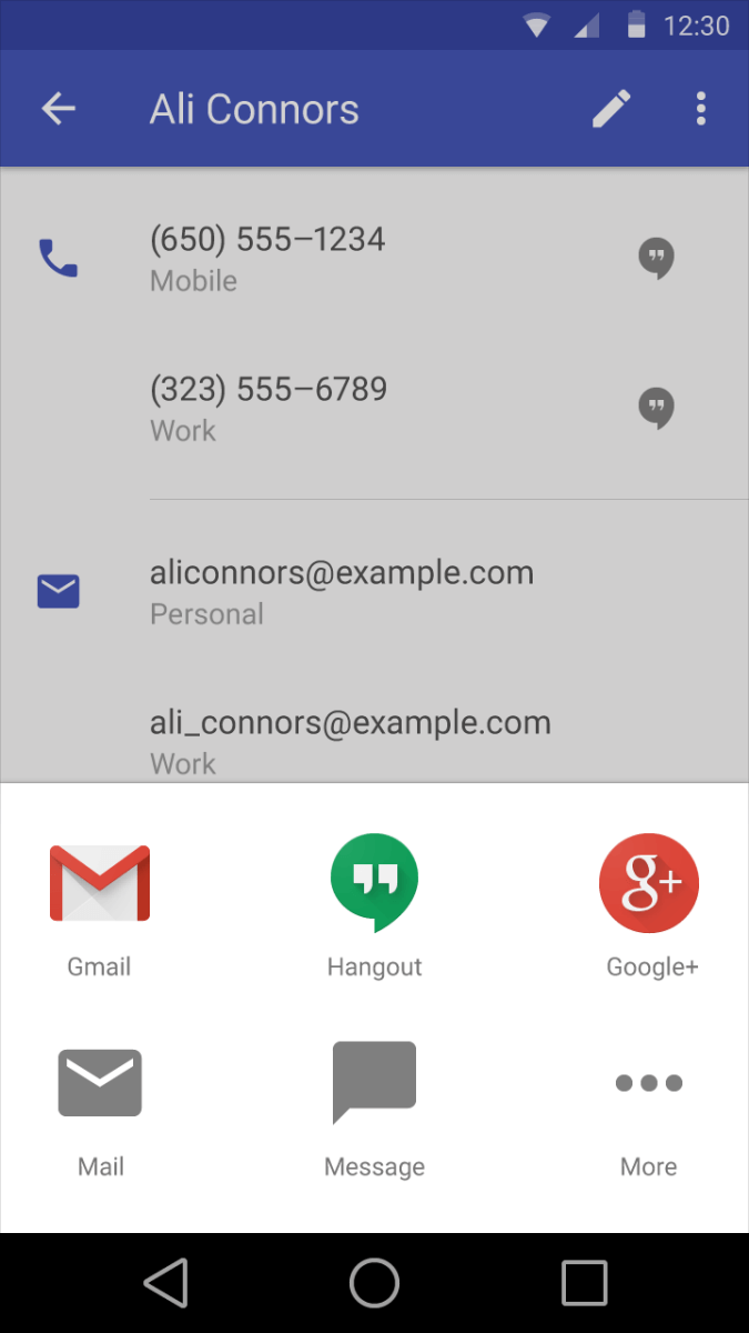
The contacts app has a much simpler look with share cards that give access to all the details and social profile information.
Caller app
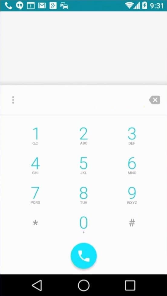
The call app has gone all white with a round call button, which when I last checked was the same in the iOS 7.1
It was noted that there is a possibility of two system wide color schemes – black and white. Selecting one of the themes will colorize the UI elements with the chosen color. In the coming months, we will be seeing google update it’s entire ecosystem with consistent design across all screen sizes. Material design will be the core of the entire design cycle for all google products hence forth.