Every smartphone company has been venturing around the wearable device segment for some time now. So it is natural that Apple would do it too. Apple announced the device way back November 2014 and when it actually came to the stores, there was a huge demand for the device. This is Apple’s first new product category after the iPad and Steve Jobs demise. In a way, it is also supposed to showcase Apple, post Steve Jobs.
I am a huge fan of wearables. I was using a Pebble before I got my Apple Watch. I was also using a Jawbone on my other wrist. So my main concern was will the Apple Watch be good enough for me to replace both the devices? Also, since I was already comfortable with a Pebble, I was completely sold on smart watches. One key thing I was looking for was that how does Apple Watch add value over the Pebble I already own, and is it worth the premium price?
Apple Watch has been a long overdue. I’ve been using the Apple Watch since June. I never got to completing my thoughts on it for two particular reasons – One, we were waiting for the watch to release in India and second, the software it originally shipped with was not mature. Apple released the watch with a great hardware and a crappy software making it an early adopter device and not a consumer device. I guess they felt the pressure to release it soon with the growing popularity of Android Wear devices. Now that the Watch OS 2 is out, this is the OS they should’ve shipped it with. I finally decided to put my review up. This is the watch Apple originally intended to make.
With Watch OS 1, I used Apple watch just as a wearable notifier, as in I used it to see my notifications. This was something I already did with my Pebble. I felt I’d made a big mistake by paying 4 times the price of a watch I already owned for the same functionality and I had a review written for that. Surprisingly in WWDC 2015, Apple announced Watch OS 2. I decided to discard the initial review because WatchOS 2 redefined a lot of the key components about the watch.
So is it just a phone strapped onto your wrist?
Probably! But if this is a smartwatch on my wrist, I like it. Apple watch is probably for the first time an Apple product where it is hard to describe how awesome it is. When it comes to the iPhone, you can tell it has amazing apps and when it comes to Mac you can tell it has a great keyboard and stuff like that. But when it comes to the watch, everything about it is amazing. But there is no way to describe it by words or something particular. You just have to use it for two days and only then you will understand the awesomeness of the device.
Packaging
Usually, I do not talk about the packaging. But the box that this came in is really different from the ones which come with any of the apple products. Each variant comes with a different packaging. I was surprised at the size of the box and when I picked it up, it was really heavy. It was so unlike apple. It was as big as two iPhone 6 plus boxes combined. When I opened it, there was another plastic box inside which the watch comes in, the reason behind the weight. Under the box, you get the documentation, charging cable and the adapter. Also, you get a shorter version of the strap if you have small wrists. This is some good thinking Apple! The packaging felt like I was opening a luxury watch rather than a gadget. After all, Apple is selling it as a luxury product!
Variants and Pricing
The biggest feature of the Apple Watch is the choices. It comes with so many choices which would be impossible for any other manufacturer to achieve. To start with, there are three categories: Apple Watch Sport, The Apple Watch and Apple Watch Edition. All these watches come in two different sizes: 38m and 42mm. 38mm is targeted for women who have small wrists. Personally, I felt even the 42mm was small.
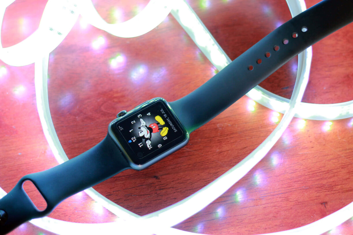
Let’s start with Sport. This is the one I have with me right now and the one used for our review. It has an aluminium casing which has a matte finish and an ion-strengthened glass. This glass can get scratched, but is pretty strong from being shattered when dropped. The straps are silicon which holds pretty well against sweat. 38mm version costs Rs. 31,000 and 42mm version costs Rs. 35,000. The casing for all the watches are in silver colour except for the black. If you buy the one with black strap, you get it with black casing.
The next one is the Apple Watch, comes with a shiny aluminium casing similar to the ones used in the first iPod Touch. The casing makes the watch is a bit heavier than the sport variant. Also, this one comes with Sapphire Crystal glass, the second hardest transparent material after diamond. This glass does not get scratched easily. But it is brittle when compared with the ion strengthened glass of the Sport Model. So if bumped really hard, the glass will shatter. It comes with various different bands like premium leather, milanese loop and link bracelet. The range for this is from Rs.49,000 for the 38mm watch with silicon strap and goes all the way upto Rs.96,000 for the 42mm Link Bracelet version.
The final one is Apple Watch Edition, ultra premium segment. This is for celebrities and folks who have a lot of money to throw around. All of them come with Sapphire crystal like the Apple Watch. But the casing is where the changes kick in. It is made of gold. Actual gold! They are not gold pated, but solid 18 Karat gold. The pricing for this is around Rs. 14.2 Lakhs exclusive of the taxes! Right now, this is the most expensive Apple product in the Store. Even the top of the line Mac Pro is not this expensive. These watches are not available in all Apple Stores and if you want to check them out, you are taken to a separate room where the watches are kept in lockers!
Design
Apple always excels in their design department. The same goes to the Apple Watch also. So much thought has been put into each model of the Apple Watch that everything is beautiful and it gets difficult for you to decide on the one you want. It comes with a digital crown on the side which makes it look like a traditional watch. But most of the time, it does not look like any of the traditional watches we’ve ever used. One of my biggest concern from the photos on Apple Website was the watch was fat. But that’s not true. It is well within the acceptable limits. The design is flawless and probably the best one when it comes to smartwatches. It looks better than the circular watches from Android Wear too. But that is a personal choice.
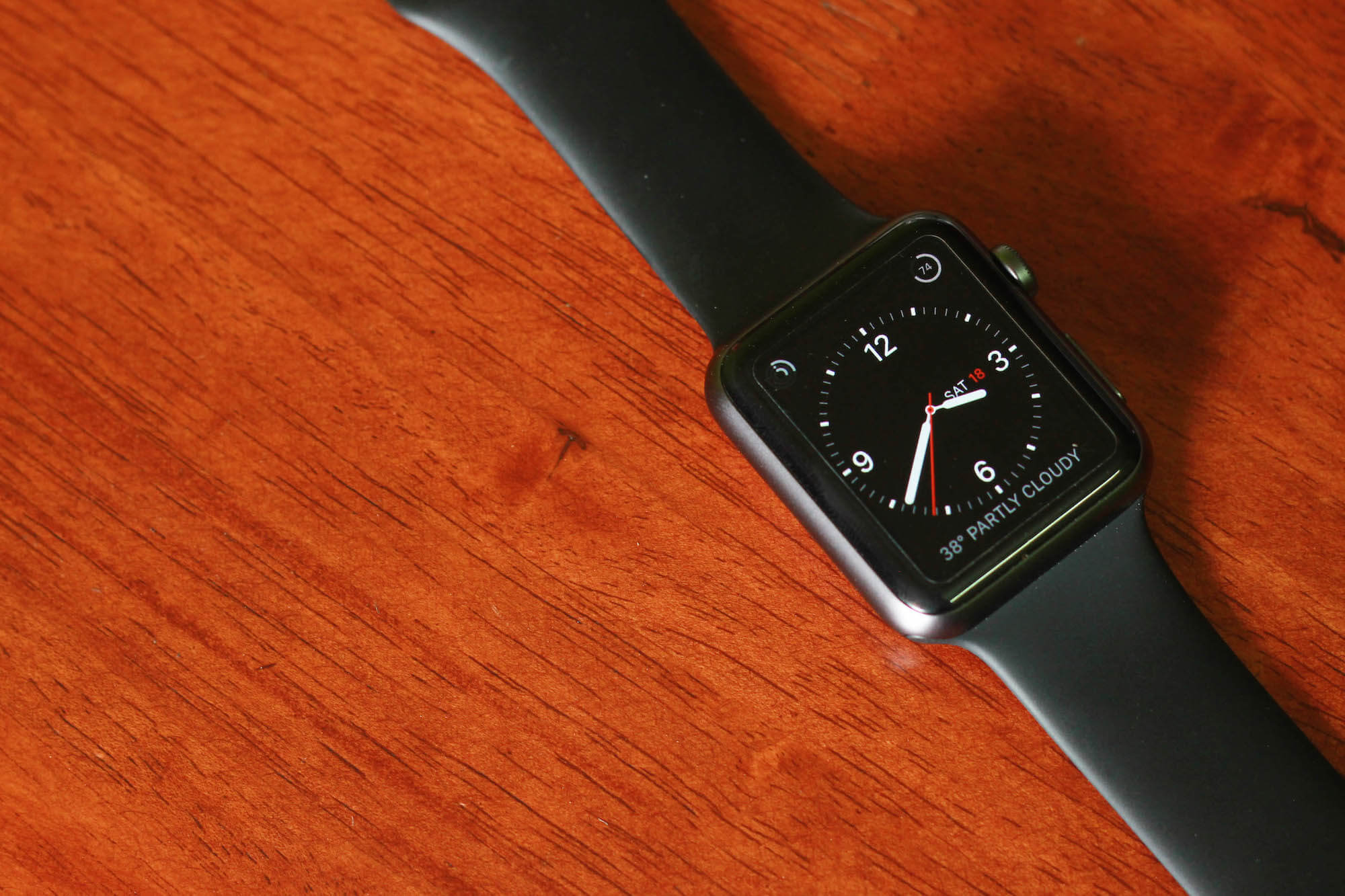
The biggest part of the design is the screen which covers over 90% of the surface of the watch. Apple watch comes with a smooth, curved glass surface which makes using the watch a pleasure. It is not an always ON display. You can either touch the screen to turn it ON or raise your hand. This feature is available in most of the wearables. With my testing, the raise to activate was perfect on Apple Watch. It works 95% of the times, when compared to Moto 360 which worked less than 50% of the times. It is these little things which makes the watch a pleasure to use. The watch faces are too damn amazing. You can be as minimal as you want or go all details and make it look like a flight dashboard. Whatever your choice is, it makes the watch look amazing and make you stare at the screen for minutes watching the time pass by!
The next part to the design is the bands. You get one band with your watch according to the model you buy. But these straps can be swapped using a quick release button on the back. It takes a quick few seconds to swap bands. Apple expects it’s users to use multiple straps according to different activities and occasions. You can buy a variety of watch straps sold by Apple. These straps scream quality and perfection, but at the same time are really expensive. For example, the link bracelet is $500 which is more than an Apple Watch Sport. Don’t worry, you can still use third-party straps and you can get a metal strap for less than $50.
Hardware
One of the biggest hardware feature is the digital crown. This is something Apple had to re-invent for the 21st Century. The thing about smart watches is that their screen is really small. Touching the screen for small one time action is fine because it takes 1/10th of a second. But when it comes to something like scrolling, your finger would take up the entire screen and you wouldn’t be able to interact with the device efficiently. So, Apple had to invent a new form of interaction, the Digital Crown. Crown is something that has been on watches for hundreds of years. Apple took the same crown and it now converts physical rotation to digital signal. This is genius! Something as small as a crown makes a lot of difference in actual usage. Also, it adds some style to it setting it apart from other smartwatches.
Force touch is another technology Apple created for the watch and made it’s way to the latest iPhones. With the small screen, the canvas is limited. They had to add new ways to interact with the watch. After the digital crown, they got the force touch. The watch detects how hard you press the screen and displays the additional information. Usually, it is used by apps to go to the main menu.
Next up is the microphone and speaker. The microphone is amazing, it is as good as or even better than the one on my iPhone. The quality was so good that the person on the other end did not know any difference between a quite room and a busy road! Unfortunately, the same cannot be said about the speaker. It is terrible and very feeble. It is not meant to be used outdoors. If you’re in a quiet environment, you might hear the sounds. It is decent enough for alerts only.
The watch is built sturdy enough, but Apple claims it is only splash proof. The watch has been tested extensively by various people for hours inside swimming pools and it lasted pretty well. So the watch should easily survive more than just splashes. A heavy rain should not be an issue.
Notifications
When it comes to Smart Watches, the most important feature is supposed to be notifications. It is a standard which every modern smartwatch comes with. Every other feature comes later. How does Apple Watch handle notifications? In one word, it is just Perfect! It is unbelievably good, making me wonder why no other manufacturer has done this till now.
While the apple watch is being used and a notification comes in, the phone won’t buzz and the screen won’t turn on. Instead, that part is taken care of by the Watch which vibrates and plays the notification sound. The screen only activates only when the watch is being raised. It would not be fair to tell the watch vibrates. It is what every other watch does. Rather, Apple calls it a gentle tap. It uses a Taptic Engine similar to the one used on the force touch trackpads and the iPhone 6s. It feels like someone is gently taping you instead of a harsh vibration. The notification is easy to ignore if you are busy with something else.
Watchfaces
Every watch has one purpose: to tell the time. With a smart watch, you can choose how you get to see the time. Go analog, go digital, see the weather, number of hits on your website or anything you imagine. It is all there. One disappointing part of the Apple Watch is that the watch faces are not open to developers. This means you are limited to the faces developed by Apple. Don’t worry, there are plenty of faces to choose from. But I really hope they open it up in the future.
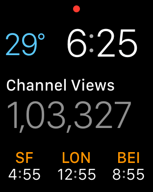
Complications is one feature that I was really excited about. In watch faces like the modular, you can choose to have a lot of details. But the problem was that you only could have the details Apple created. So I ended up having things like the moon phase which I never cared about. With WatchOS 2, developers can develop their own complications. This is an amazing feature if you want to constantly check something that changes with time.
One place where I use complications every day is with the Numerics app. It has a complication to set any metric I want to constantly check. I can keep track of the number of views on our YouTube channel throughout the day with a flick of my wrist. Seriously, this is amazing and time saving for someone like me who is obsessed with little things.
Software
Any device has two things: The hardware and the software. With the perfect hardware, WatchOS 2 brings in the perfect software. Apple Watch has some of the most unique features which will truly revolutionise the way we communicate and connect with people. The software is definitely complicated and takes a couple of days to get used to. This is because we are dealing with a new category of device for the first time and Apple really had to change how things worked.
Native apps is the first thing which WatchOS2 brought to the tables. Perviously, developers had to stream the app via bluetooth from the phone. At times, it took a whole minute to open something as simple as the Uber app which killed the purpose of having a smartwatch. With Watch OS 2, apps can run natively on the watch and they open really fast just like any app on the iPhone. Although, a lot of developers have not been updating to native apps including Uber. Some of the developers I spoke to claimed developing native apps for Apple Watch was really hard and it was not convincing enough for them to pour their resources into it. I guess we’ll have to wait a little longer for developers to start using it. But for apps which are native, they work amazingly well. One of the app which I constantly use is Trivia Crack and the app is as fast as playing it on the phone.
Pairing the watch to the phone is super easy. Boot the apple watch and open the watch app which comes by default on every iPhone, you like it or not. A video loop plays by default on the watch. The iPhone app, it opens the camera which you point towards the looping video on the watch, and thats it! The pairing process is done.
Glances is another feature which is supposed to give quick access to information. Think of glances as a quick access menu on the watch or like the widgets screen on your iPhone. It runs widgets for various watch apps and you can interact with them. Simple tasks like checking the weather, controlling music playback and checking-in on Foursquare can be done. Glances can be accessed by swiping up on the screen from the watch face.
Time Travel is a feature which can be used with watch faces like Modular which has a lot of complications. The digital crown can be rotated to move through time (on the Watch!). Although this sounds pretty cool, I never really use it in my everyday workflow.
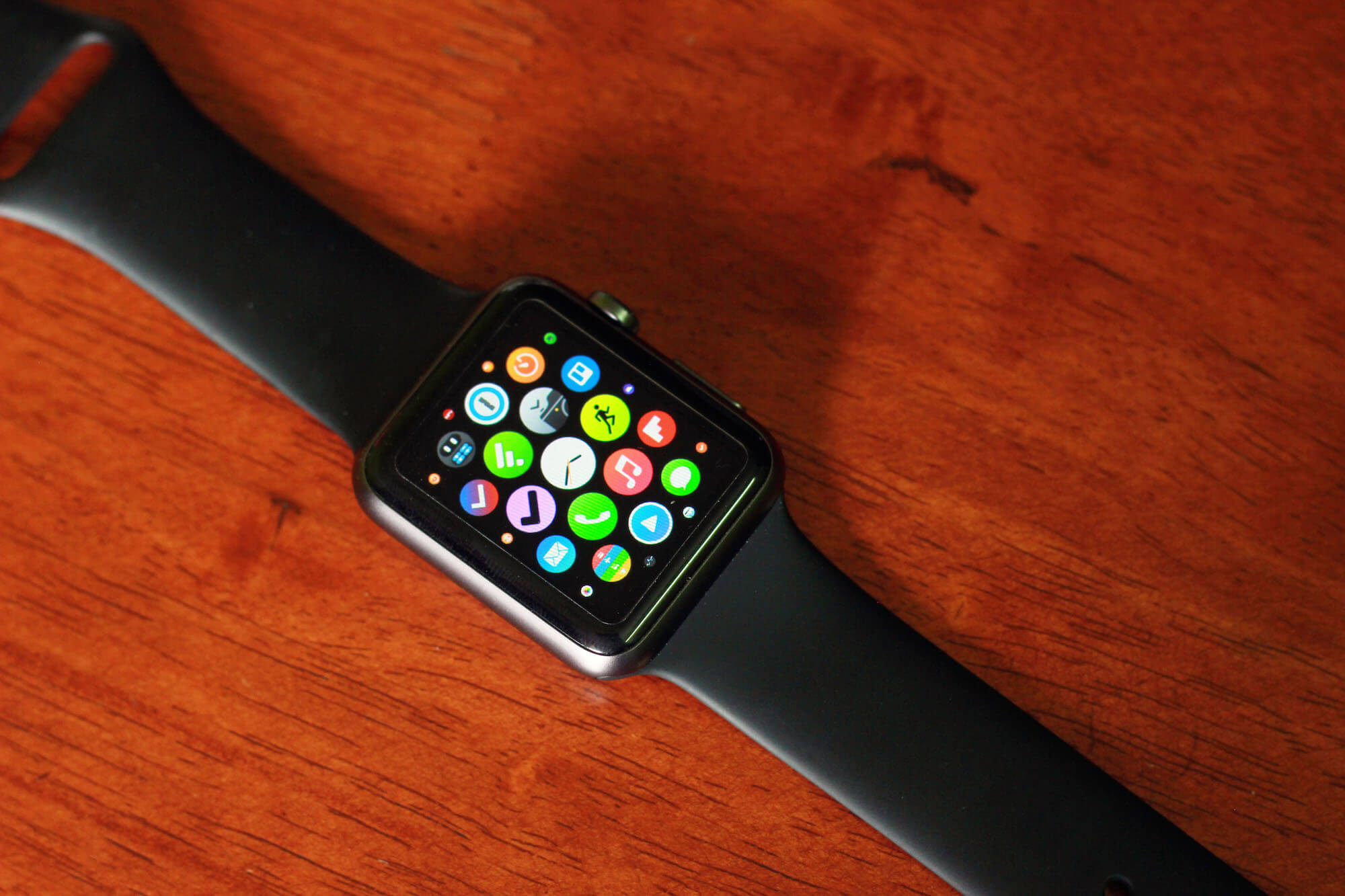
Apps menu is something that was really controversial when apple showcased the watch. Since the first iPhone, we’ve had pages to swipe to reach apps. Now with the watch, pressing the digital crown which brings up the circular icon menu. It shows app icons in circle and they are arranged on one surface which you can glide over. At times, it is impossible to find the app you want. There is no structure to it, but you can get used to it over time. The only way to arrange these apps is using the companion watch app on phone.
Hand off is one feature where I was really blown off with. The watch can be used to do simple tasks. But when something complex needs to be done, you’ll have to reach for your phone. Let’s say you receive a new mail notification and you want to type out a long reply, hand-off gets activated on your iPhone. A small Mail icon appears on the bottom left corner of the Phone and sliding it would take you directly to that mail. OK, this is pretty cool. But it gets even better. Let’s say Mail notification comes in when you’re using your Mac. The Hand off works from the watch to your Mac! For some it might not seem very interesting, but I was really blown away with how well this was executed. You get a notification on your watch and in less than half a second, you can interact with it on your Mac. It all works flawlessly, every single time like it is meant to be.
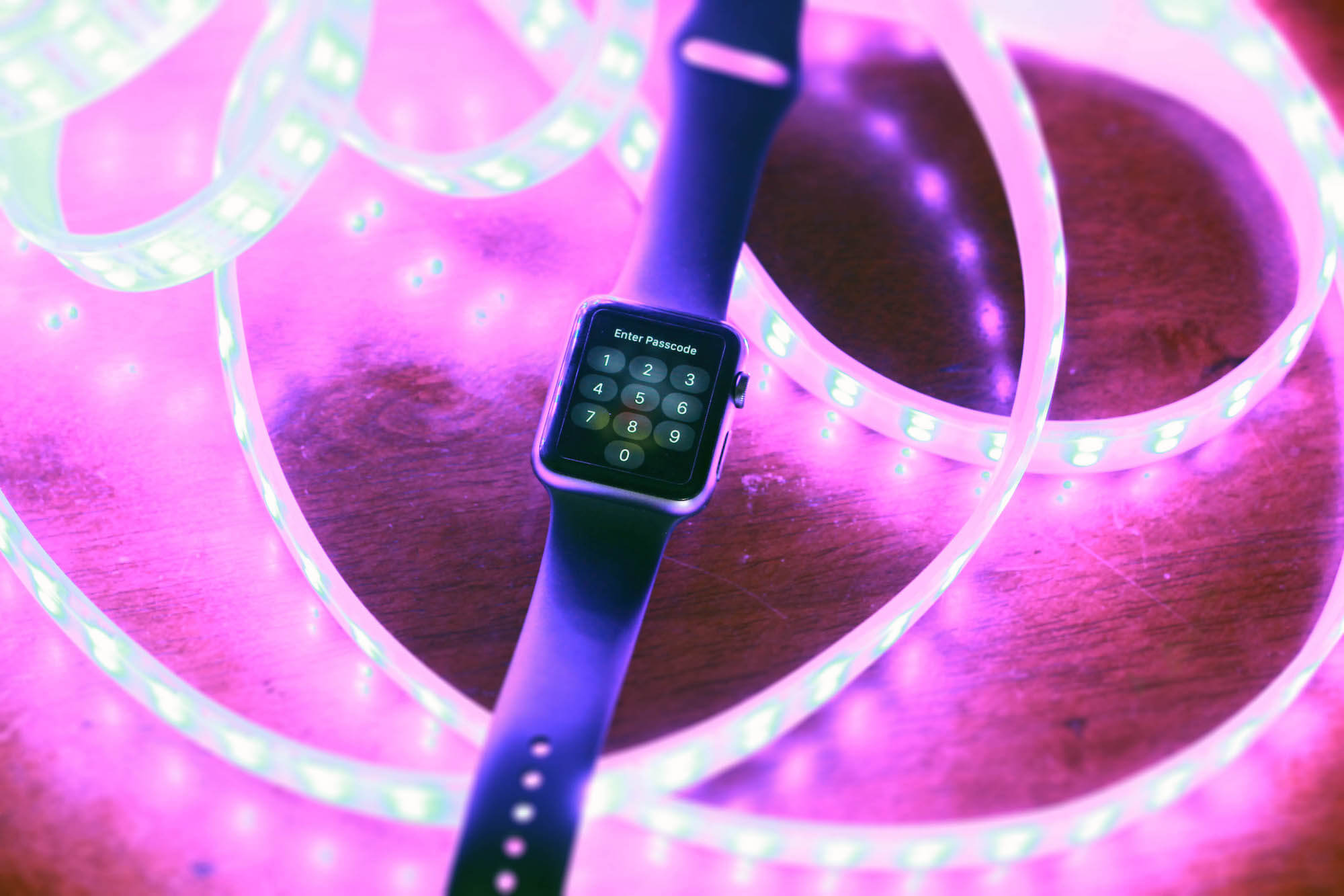
There is a passcode lock on the watch and it makes a lot of sense to use one because private messages and apps can be accessed on the watch. This is another feature which has been flawlessly executed. You will have to enter a four digit passcode on the watch and if the watch is on your hand, you will not have to enter the passcode again, till you remove it. Also, you can choose to unlock the watch by just unlocking the phone.
Apple claims the Apple Watch to be the most personal communicator. It helps connect with people you care about the most. Of course, they should also have an Apple Watch! Apple has dedicated a whole button to connect with your friends. The button below the Digital Crown can be used to bring up the first level contacts which you set. Once a contact has been selected, there are two options: Call and Message. There is one little option which shows up between these two if the other person also owns an Apple Watch. Over here you can draw stuff on your friend’s watch or send gentle taps. You can also send your heart beat using two fingers to show proof of life! This can be both fun and annoying at the same time.
Music is where you’ll be able to use up the space on your watch. It can be used as a remote to play, pause and choose music. All of it is done using touch and I am supposed to look at the watch even for simple tasks like going to the next track. This was never the case with my pebble. It felt so easy and natural. Since the watch comes with 8 GB of storage, playlists can be stored on the watch. It has a limit of 100 songs though. This is really useful because a bluetooth headset can be directly paired with it to leave your phone behind while working out.
The low power mode is used to really push the watch battery to extreme levels. Right now, I’m easily able to get one whole day with heavy usage and two with minimal usage. The low power mode can be activated during desperate times. You can easily get one full day with less than 5% battery when in low power mode. It cuts off everything Apple Watch can do, making it a $400 watch which just tells the time.
Nightstand mode is another feature which came with WatchOS 2. When connected to the charger and placed horizontally, it displays the time and the next alarm. When the alarm goes off, the digital crown becomes the snooze button and the friends button is to end the alarm.
Photos is an app which was criticised heavily when the Apple Watch was announced last year. The biggest question was why would anyone want to store my photos on their watch? Well, I am not sure why you might want to view the photos on your watch. But if it interests you, upto 500 photos can be stored on the watch and accessed even when the phone is disconnected. One use of having the photo album is for watch faces. You can set either one photo as your watch face or have a slide show which displays a different photo every time you raise your hand.
Camera remote is another Apple app which runs natively on the watch and controls the camera app on your iPhone. Opening the app would automatically open the camera on the phone. The watch app only has two buttons and a live camera feed. One is the shutter button and the other is shutter with a 3 second timer. It is as simple as that! This is one app which I use pretty frequently.
Maps is an app which is pretty cool but unfortunately sucks. While navigating using Maps, the watch vibrates in a different way for left and right turns. But it is really unfortunate that Apple Maps is not available in India. So there’s no way I could test those cool feature. Google has it’s own Maps app on the watch. But it is no where close to the Apple Maps with it’s interface and features. You are better off with the maps on your phone.
Siri
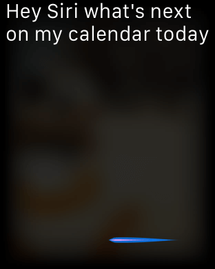 Siri is a huge deal on the watch. You can look at things on your watch like apps and notifications. You can use the touch screen for simple actions. But to get some complicated task done, you have to use Siri. This is where the hardware really shines. The microphone is beyond amazing. The microphone makes Siri reliable every single time. Also, it is always listening for ‘Hey Siri’ when the screen is on. So you can just raise your hand and say “Hey Siri, remind me to get some milk when I leave work” and it’s done!
Also, the Siri on watch is ridiculously fast. At times, Siri on watch is faster than Siri on Phone. Also, it can be used for things like placing phone calls or sending a quick message. It can also save you from going to that app menu: You can ask Siri to open watch apps. One disappointment though is that I’ve been used to listening to Siri’s replies and with the watch, Siri is just limited to text.
Calling
It is one feature I do not really use much on my watch for two reasons: It does not have the perfect hardware for this task and I do not want to look stupid. The microphone on the watch is just amazing. But the speaker is really disappointing. You can place and receive phone calls on our watch. That part works. There is no way you’ll be able to hear the person on the other end outdoors. The only place where you can use it is if you’re alone in a room and there’s no noise. Also, I do not want to talk into my watch when I am outside. I can, but I won’t.
Messaging
Just like calling, you can create and receive messages on your watch. When you receive a message from someone, you can respond back to them quickly. Based on the context of the message, the watch automatically suggests replies which you can send in one touch. If someone is asking you a question, you usually have replies like Yes and No. You can also reply back with custom emojis. Also, there is a set animated emojis which are exclusive to the Apple Watch.
When seen on a phone, they are like animated GIFs. You can scroll through them using the digital crown. If both do not serve your need and you need to send something specific, you can use Siri to dictate your message. Since the microphone is amazing, the accuracy of dictation is also good.
Wifi connectivity.
With WatchOS 1, the watch could connect to the phone over wifi. Let’s say you are home and chances are, you don’t have it in your pocket all the time. You just leave it behind in one place and move around the house. There is no way Bluetooth range extends beyond the room the phone is in. So the watch connects to the wifi network your phone is connected to. With WatchOS2, apps can directly connect to the internet without using the phone. If your phone is dead and you are close to a known wifi, the watch latches on to that wifi network and pulls in data. You can use apps that connect to the internet and receive messages even though your phone is dead.
Apple Pay, Passbook.
Apple Pay does not work in India. Although, I wish it did. So there is no way for me to test that. But the idea is that you tap your watch to the card reader in the counter and it’s done. Yes, it saves a few seconds and feels futuristic. Passbook works in India though. It is pretty cool to show my movie ticket from the watch and enter the cinemas.
Fitness
Like I said in the beginning, Apple watch has helped me replace two wearable device that I was already using: Pebble and a Jawbone UP. I have been a fan of Jawbone ever since their first band. I wear them every day. But after I got my Apple Watch, I replaced that with the watch. It does pretty much everything the Jawbone does and integrates better into the ecosystem.

The watch comes with an amazing accelerometer which takes all the movement as input. Next up is activity tracking. It tracks your movement throughout the day just like any other fitness band. It comes with three core functions: Move, Exercise and Stand. Move calculates the amount of calories you’ve burnt throughout the day. Exercise calculates the amount of time you’ve exercised for the day. Stand is the number off times you’ve stood up at least once each hour in a day. The centre for fitness is the activity app on your phone. It is there on all iPhones, but only appears for the first time when you pair your device with an Apple Watch. Goals can be set for all three of these categories and they are represented by nice circular rings.
Heart Rate monitor is another amazing function of the Apple Watch. There is a heart rate monitor in the bottom of the watch which is covered with Sapphire crystal glass so that it never gets scratched. It automatically runs at various times of the day to monitor the heart rate.
Workouts is another watch app from Apple. All the intense workouts like running, cycling, walking and many more can be monitored.The best part of the app is that it works without your phone for most of the workouts like running and jogging. But for things like cycling, it requires the use of GPS. So it needs to be paired to the iPhone. This is way better than any of the workout monitoring apps I’ve used previously. Also, while running a workout session, the heart rate monitor is always ON so that you can check on it every second. This really helps you to keep a check on the intensity of your workout. Also, since you can sync upto 100 songs in your watch, you can pair a bluetooth headphone directly to your watch. This way, one can leave the phone behind and go on a run listening to music.
One clear disadvantage of the apple watch comparing it to any other activity tracker is it’s battery. Nothing much can be done about that. Also, most of the activity trackers come with sleep tracking, which the watch definitely lacks.
iOS Watch App
The core part of the watch is it’s phone app using which is used to pair the devices. One big disadvantage of the app is that it ships with every iPhone. Which makes it an another app to add to the Apple Junk folder if do not own a Apple Watch. If you have the watch, you wouldn’t want to have the app in that folder.
The app is divided into four sections: My watch, Explore, Featured and Search. My watch is to change the settings on the watch, Explore is to check out the features of the Apple Watch, Featured is similar to the featured section on the App store which has all the featured Apple Watch Apps and search is to search the app store for apps which support the Apple Watch.
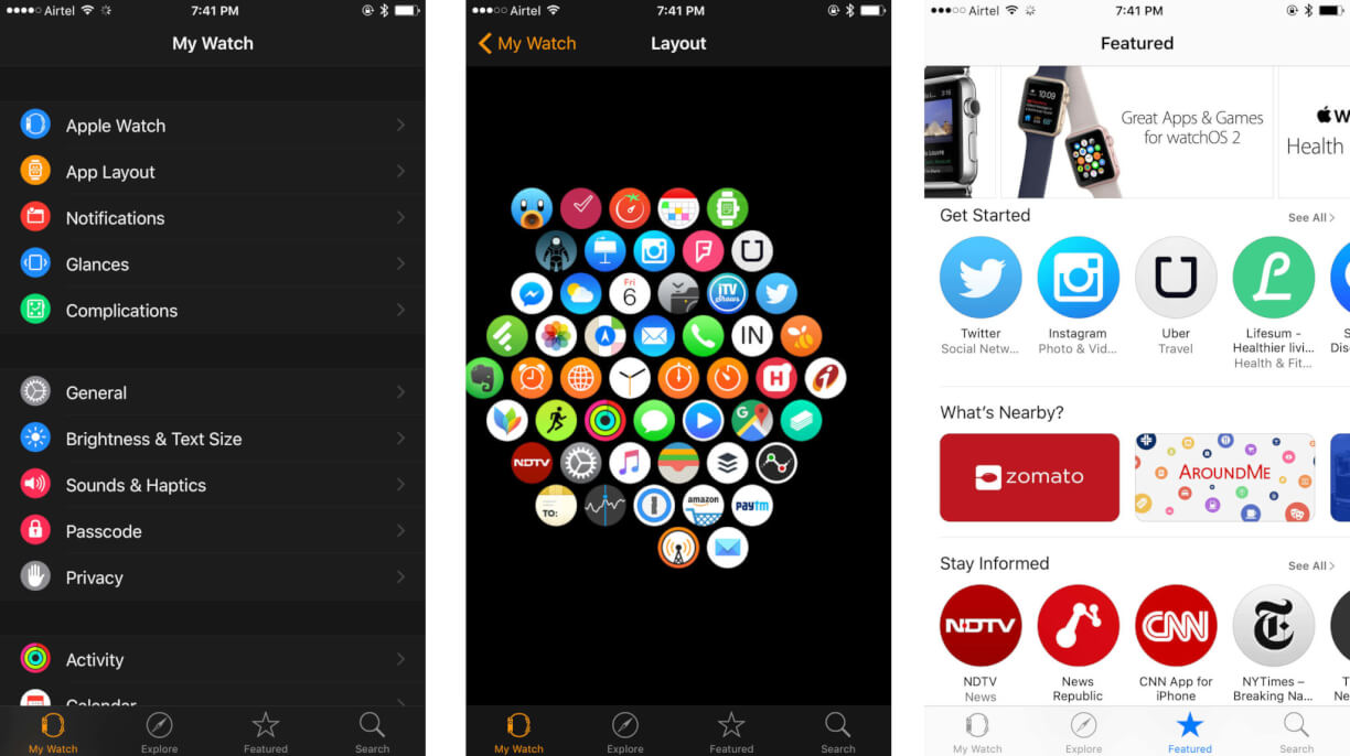
The important part of the app is the My Watch Section where all the real action happens. Using this app is the only way to install, delete and rearrange apps on the watch. Changes for which apps can use glances and complications can be set here. Most of the settings is done on this app, things like how do not disturb, sound and privacy works.
Internals
People should not be really worried about these details, but just in case you want to know, the watch comes with 520Mhz Single Core Apple S1 Processor, 512MB Memory and 8GB Storage. All you have to know is that this is good enough for stuff to do on the Apple watch. The watch never lags and the processor is definitely battery efficient. The storage on the device is 8GB out of which 6.1GB is usable to store Apps, Music and Photos.
Battery and Charging
The battery inside 38mm and 42mm is different because of their sizes. 38mm comes with 205 mAh and 42mm comes with 300 mAh. There was a lot of complaining initially about the battery by the reviewers but when actual consumers started using it, it was the opposite. When I got my hands on one, I was surprised! Seriously. Something is wrong with the other reviewers out there who claimed the battery sucks. The thing about smart watches is that they are watches, not phones. The way one would use them in everyday life would greatly differ.
An average person would easily get through a whole day. I am awake for 20 hours a day and I’m wearing my watch all the time. I make a few calls, use Siri a few times, even play a few games and a minimum of a 30 minute work out. Also, I get close to 1000 notifications a day. With this kind of usage, usually when I got to sleep after 20 hours, it still has 30-40% battery remaining. This is damn good considering the kind of battery every other Android wear watches have. This is a new standard for watch batteries.
The watch comes with a low power mode where it displays only the time and with 10% of battery in low power mode, it would last days. The thing is, the battery is too damn good that I never actually used it. I just used it once to check out how that works.
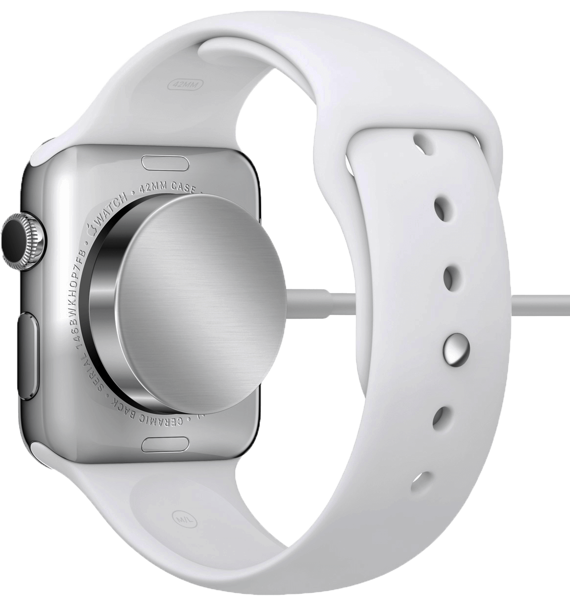
The charging part of the watch is awesome, It’s like a wireless magsafe connector. This is Apple’s first product to come with wireless charging. The cable is really long so that you can run it all the way up to a typical bed stand. When the watch is brought close to it, it automatically latches itself and starts charging. The charging time from 0 to 100 would be about 90 minutes.
Conclusion
The Apple Watch is pretty great. Definitely the best smartwatch out there right now. But then, there’s the other thing with the price. The price you spend on a sport watch is totally worth it. It is a really powerful device which is expensive to build, which ends up making the customers pay more. For a country like India, it is on the expensive side. Anything other than the sport watch, you are just paying for the cosmetics of it. If you really want the premium a finish, go for the other variants. Otherwise, just go ahead and get the Sport watch. It has the same set of features.
The necessity of the watch itself is very difficult to answer.When someone asks me if the watch is worth what I paid, it is really hard to answer that question. I could tell what it does, but it does not answer if it is worth the price tag.
Apple Watch is the first device I have ever encountered where it is difficult to describe why the product works well. You have to use it for a couple of days to understand what it’s all about. The device feels magical, just the way you feel after using the first iPhone. Apple is finally in the wearable segment and they have come up with a device that is completely futuristic and would easily take the competition a few years to catch up with it.







2 thoughts on “Apple Watch Review”