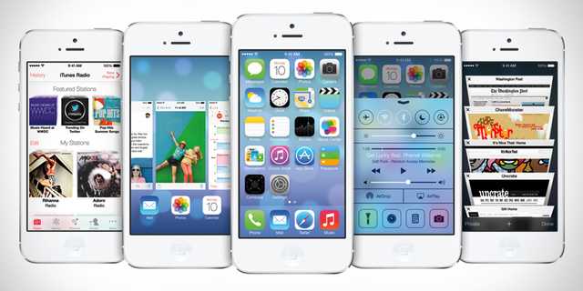
This is the biggest change done to the operating system since the introduction of the first modern smartphone as we use them now. Though everyone were shocked to see it for the first time, it grows on you. It was introduced way back in June and we’ve been testing since then. Apple could’ve stuck with the old UI for a year longer and still have survived. But, the collaboration between Jhonny Ive and Craig Federighi made sure Apple did a lot of innovation to bring the biggest visual update to the OS. We know, we are a little late to the review party. We just had to make sure everything was right and we had a personal experience with it for some time before the review.
Yes, using it for the first time made the OS look a bit awkward. But after a few days of using it, the OS looked a lot more mature and close to perfection. The major change was the removal of visual cues which were related to the real life things. Till iOS 6, the notes application looked like a leather notepad with yellow pages and the clock application to give a feel of a real life clock. With the introduction of iOS 7, Apple stripped all of these cues down and made a simple UI.
Minimalism is the ultimate sophistication
Initially with the release of the first iPhone, those cues were necessary for people to get adapted to the new smartphone interactivity. Now is the time to change. We no longer need them. We no longer need the shadows. Now, we directly interact with the glass of the screen. The OS feels more alive and joyful to use.
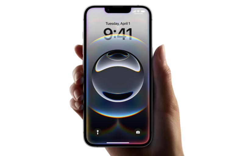
The first thing you’re going to notice when you switch your screen on is the wallpaper. The wallpaper uses the gyroscope to give a neat parallax effect thus giving it a multi layer effect rather than a fake three dimensional effect. You feel the icons to be a layer above the wallpaper and it seemingly convinces your brain. PS: You can waste hours playing with it.
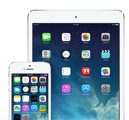
iPhone:
iOS 7 on the iPhone makes the device feels a whole lot powerful. The best part is the OS is butter smooth on all devices including the three year old iPhone 4 though it is missing some of the new features. It makes you feel getting your work done a lot faster.
iPad:
With the larger screen, iOS 7 is magnificent making any other OS shy to come out. The screen feels a lot more alive and you notice the finer details in the design on the larger screen. This is also butter smooth even on the age old iPad 2 with the parallax wallpaper.
Features:
Control Center:
This is probably the biggest missing feature on iOS which has been there on other OSes for a long time now. Pushing your finger from the bottom of the screen will bring up the control center which gives you a set of toggles and access to some applications. The toggles include: Airplane mode, Wi-Fi, Bluetooth, Do not disturb and rotation lock. Applications include torch, which lights up the flash LED, timer calculator and camera. None of these can be changed. It also includes brightness slider, music controls and Airplay, Airdrop(more details below on airdrop) toggles.
Notifications:
Notification on the lock screen highlights the latest one as they come. When you pull down the notification menu, you are given with three menus – Today, All and Missed. Toady view shows you the date, calendar, stocks, weather and reminders. Also, like it reminds you the right time to leave when you have an event scheduled at a different place by knowing your location and analysing the traffic on the route. All notifications just shows all the notifications that were received. Missed shows all the notifications which came in when the phone was locked.
Spotlight search:
Now accessing spotlight search is even easier. Pulling the screen down will bring the spotlight on any page.
SIRI:![]()
SIRI is finally out of beta since it’s introduction for the first time two years ago with the iPhone 4S. SIRI is now more reliable and accurate. SIRI is a lot more mature now and has come a long way since it’s introduction.
Ringtones:
There is a whole new set of ringtones which come along with iOS 7. The best part is that they sound great which also happens to be the worst part because now I have a huge confusion on which one to use.
Wallpapers:
There are two sets of wallpapers now: Dynamic and static. Dynamic is limited to only the ones in the settings and you can’t add any of your own. Coming to the static wallpapers, they just look great.
Dynamic Text:
There is a new feature buried inside Settings>General>Text Size. Here, you can change the text size of all the apps which support dynamic text type.
Folders:
Apple has finally brought in folders with unlimited apps. You can store any number of apps in a folder with 9 apps in each page.
Airdrop:![]()
Airdrop is an interesting addition to iOS 7 which address file sharing but is still limited to iOS devices. It works similar to the Airdrop in OS X but this uses bluetooth also. It first establishes the connection using bluetooth and then transfers the file through Wi-Fi making the transfer times incredibly low. It works with the photos app. The API is accessible for the developers. So we can see a lot more interesting apps using this feature soon.
Find My iPhone:![]()
The new find my iPhone is expected to drastically reduce iPhone thefts. It locks the boot loader then lost. So, even if the phone is restored it can’t be used and you’ll be able to track it.
iBeacons:
This is definitely a huge technology which Apple didn’t explain much about at the WWDC. This is a technology which is set to kill the NFC which is there in almost all high-end Android devices now. This uses the low powered Bluetooth 4.0 and is more efficient and secure.
Applications:
Flat is the new sexy.
The OS has been flattened. Next is for the developers to do the same. Most of the essential apps have already been flattened out. What about the native apps?
Calendar:
The calendar looks extremely impressive as compared to the previous calendar. Other than the whole new look, there are no new features.
Clock:
Once again, the UI has been completely revamped to give it a more usable interface. When it comes down to the features, it lies in the icon. The clock icon is live. That is, the clock on the icon keeps running accurately to the time along with the seconds!
Camera:
You now can access camera from the command center also. There is a load of new stuff for the camera. The important part is the effects mode which brings up nine different effects running live parallely and you can choose to shoot in any one any of them. Also, there is a burst mode which shoots 12 photos a second. The most impressive part of the burst mode is that you don’t have to choose the best photo from the ocean of photos you shot. Apple chooses the best photo for you.
Slo-Mo:
An iPhone 5s only app which shoots videos in 120fps and you can choose which parts you want in 120fps. It works great.
Photos:
Photos app organises your photos automatically according to the date and location under the moments view. There is a collections view which categorises all the photos with cities and the year view categories photos with the year they were shot.
Notes:
Notes is probably the biggest change showing the Flat and minimal UI done in iOS 7. It makes the Notes app a lot more usable now.
Safari: The navigation of Safari has been changed. You get your tabs as a stack of cards and it is easy to navigate between a lot of tabs now. Going into bookmarks, there is a Shared Links tab where you can browse through all the links tweeted by the people you follow in Twitter. Also, you can directly activate the private browsing from inside of the app. Also, the new Safari is incredibly fast.
App Store:
Genius Recommendations for the app store has been removed. Instead, there is apps near me through which you can see the most popular apps near your current location. This way, if you’re in a theatre, it’d show you apps which are popular there like IMDB. The biggest feature though is the automatic updates of the app store. Be careful though. If you’ve enabled automatic updates make sure to disable updating of apps via cellular to save your precious bandwidth.
Phone:
No new feature update except for the UI changes which look great.
Messages:
Finally time stamps for the messaging app. Sliding your finger from right to left inside a thread will bring up the time stamp.Also, there is a neat bouncy effect while scrolling through a thread.
Music:
 Apple finally got all the record companies to sign their iTunes Radio deal and it is finally on iOS 7 now. You can listen to a radio based on a genre or a particular song. Also, you are limited to five skips per hour which does not exist if you’re subscribed to iTunes match. The cover flow is gone. Instead, you have the the album artwork neatly arranged when you go to the landscape mode on the Music app.
Mail:
The mail app comes with a better threading system now and of course the new flat look.
Facetime:
This time, Apple has done a separate facetime app to use it. The addition is, you can Facetime Audio now which is audio only call over the internet. Though this might seem small, during our tests we found it to have extreme levels of quality which are unmatched by Skype or Viber. It also uses the HD Audio on iPhone 5 and 5s.
Compass:
Compass app no longer has just the compass. It has a calibration meter also, the bubble style but flat.
Stocks:
Though there is no feature update to the app, the colour scheming of the app is really great.
Game Center:
When you enter the app, you see all our information in colourful bubbles. Surprisingly, there bubbles are not flat and they have a three dimensional effect. This is probably the only part of the OS which was not done flat.
Reminders:
All the lists are arranged in stacks and everything is more accessible now.
Newsstand:
Newsstand is finally an app. Meaning, if you’re not using it you can put it inside a folder now.
Weather:
This app is absolutely gorgeous and benchmark setting with the UI and the animations. I’m not going to write it because it is best when experienced.
Things I miss:
Though iOS 7 is a step forward, there is a couple of features missing which a lot of people used. They are the Google and Wikipedia search from the spotlight search and ability to update Facebook and Twitter from the lock screen. Hope the next update brings them back.
The icon artwork has been worked up properly to a great detail by Jonny Ive when seen individually. But as a whole when seen for the first time in the home screen didn’t look great. I don’t thing that should be a problem because rearranging the home screen with the apps you use should give you a whole different look and make it look a lot more pleasing.
More than 30% of the iOS devices had been updated with the iOS 7 in the first 24 hours and it has rocketed past 50% in less than a week making it the most successful release from Apple. With this, iOS 7 is clearly a winner. People seem to start loving the whole new OS now. I am probably hoping for a change as huge as this for the next OS X changing the way we interact with technology.






One thought on “iOS 7 – The Review”