Android L was all the rage at Google I/O a couple of weeks back. Well, we’ve finally managed to get our hands on it. If you want to experience Android L on your Nexus device, head over to the Google Developers Page and download the factory image and flash it using Nexus Root Toolkit or use one of a hundred different ways. So, let’s dive into Android L and see what it has to offer.
[column size=one_half position=first ]
Android L seems to give you as much information as possible on your lockscreen. So you can access all your notifications right from there and handle them although they’re not quite as transparent. Swipe them away to dismiss them and double tap a notification to enter the app. Swipe right and you get access to the phone dialer and swipe left to access the camera.
[/column][column size=one_half position=last ]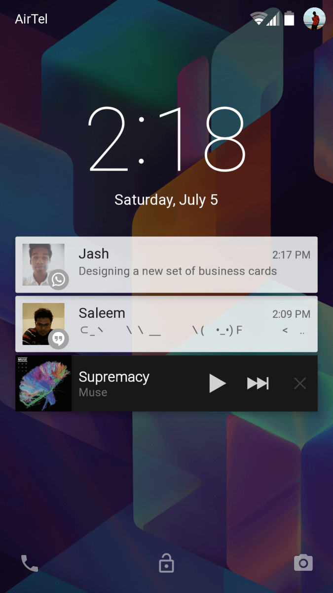 [/column] [column size=one_half position=first ]
 [/column][column size=one_half position=last ]
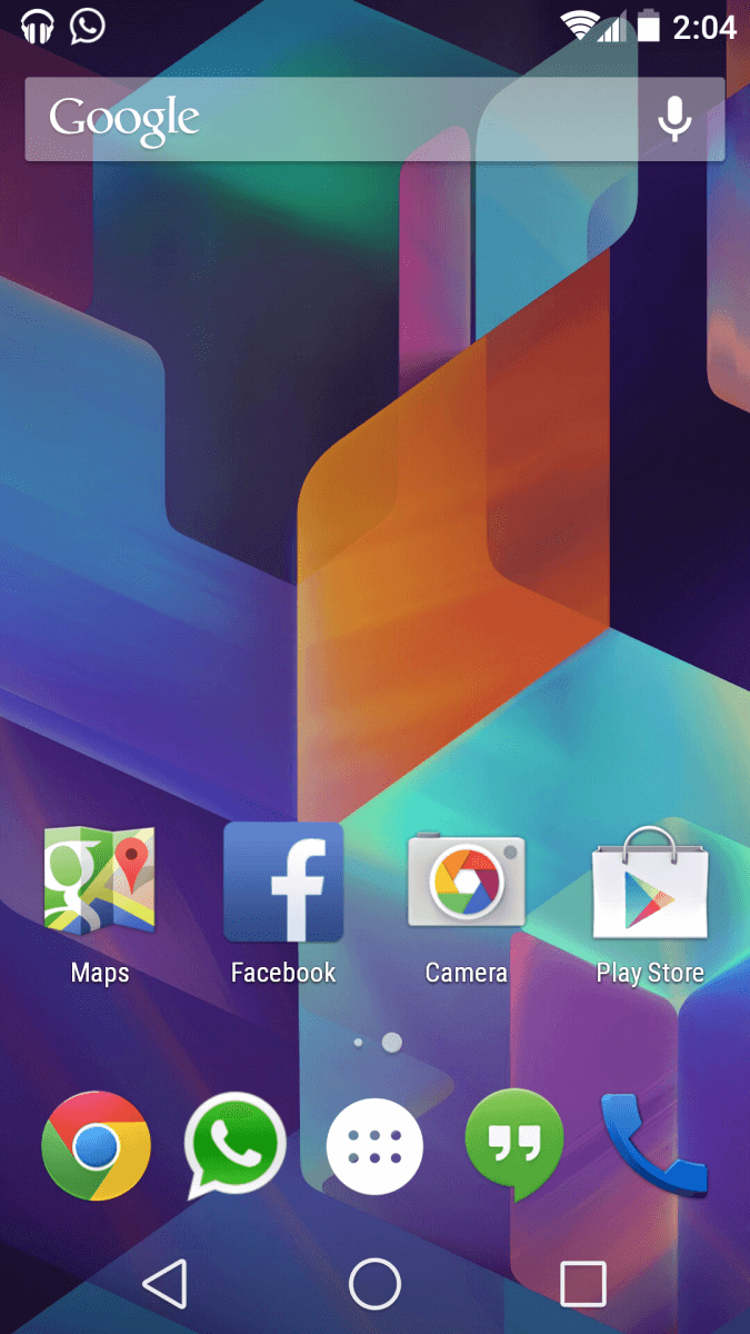
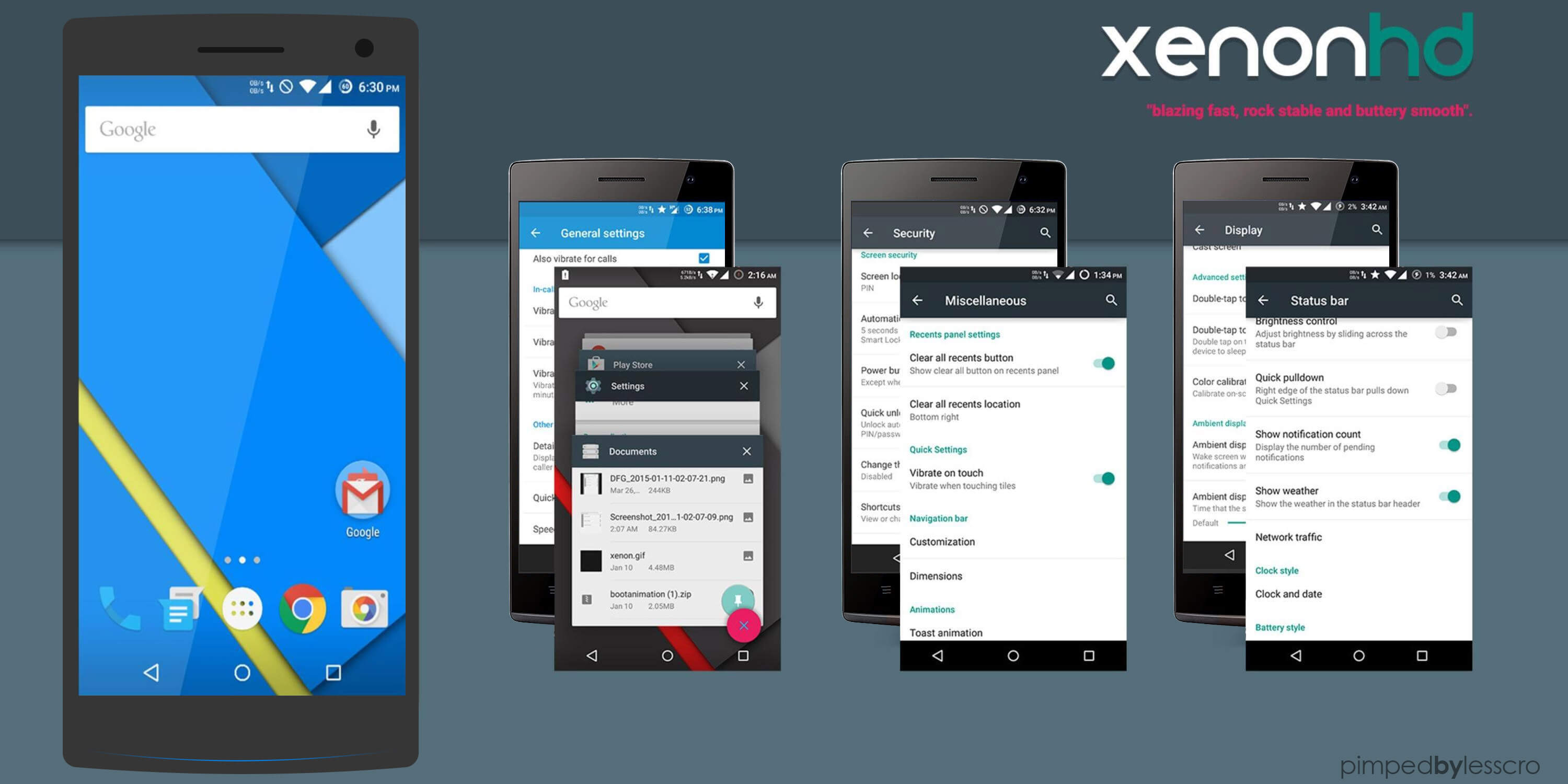
So once unlocked, you’re at your home screen. It’s pretty much the same as KitKat 4.4 except that the soft keys are changed. The gradient shadow has been removed from the bottom. It is a nice touch and you can definitely see the minimalist trend coming along.
[/column] [column size=one_half position=first ]
The notification drawer has taken on a completely different structure. You swipe down to view your notifications. Swipe down further and you can access quick settings.
You no longer have to tap that tiny button at the corner of the screen or swipe down with two fingers.
[/column][column size=one_half position=last ]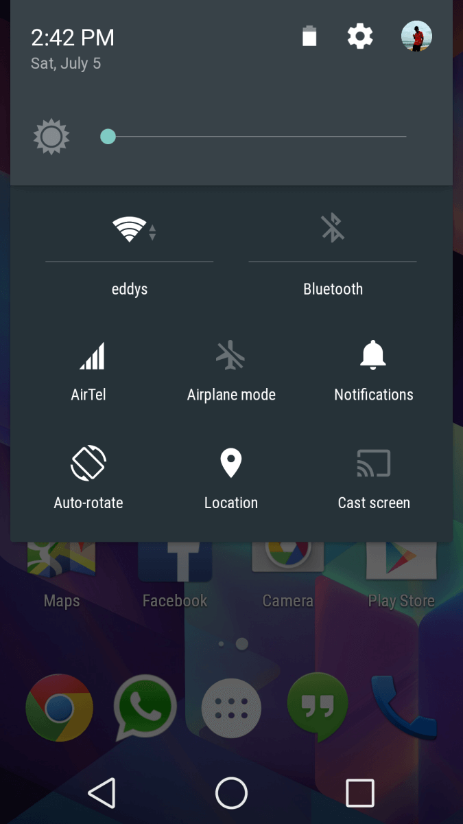 [/column] [column size=one_half position=first ]
 [/column][column size=one_half position=last ]
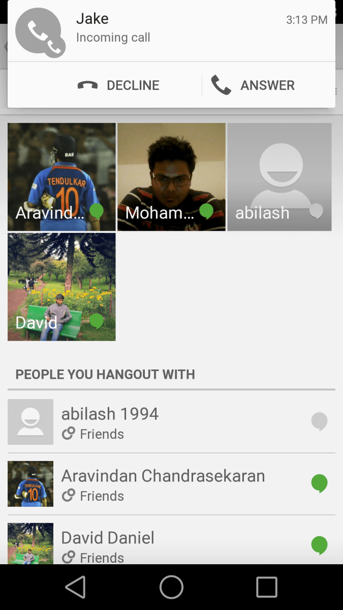
Also, if you get a call when you’re in the middle of an app, your call screen will not occupy the whole screen. Instead you’ll get a little heads up notification at the top. You can choose to answer or carry on with whatever you’re doing. This easily makes the whole experience of receiving notifications while using other applications better.
[/column] [column size=one_half position=first ]
Multitasking is also completely reshaped. All your open apps are available as a list of cards. And all your Chrome tabs will also be visible meaning you don’t have to actually open Chrome to close a tab. Although you might wonder what would happen if you have 50-60 open tabs.
[/column][column size=one_half position=last ]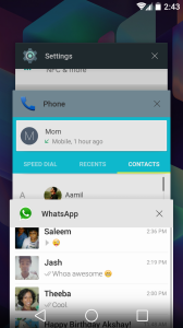 [/column]
[column size=one_half position=first ]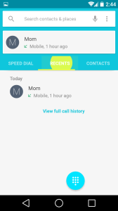 [/column][column size=one_half position=last ]
Material Design is something Google flaunted at I/O. What material design assures is that nothing in your phone will just pop out of somewhere. Every element will come out of somewhere and will go somewhere. Every touch recorded on the screen also gives you a feedback which is a neat little trick.
[/column] [column size=one_half position=first ]
The settings panel has been completely made over with a lighter tone. Android L also introduces Battery Saver Mode finally, something many people have been craving for.
[/column][column size=one_half position=last ]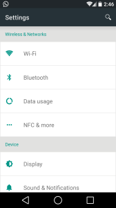 [/column] [column size=one_half position=first ]
 [/column][column size=one_half position=last ]
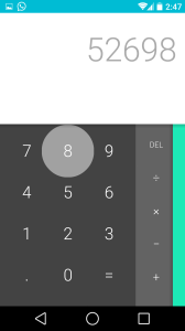
Last but not the least, the status bar changes it’s color according to the app that’s currently on screen so you don’t have to see your default black status bar all the time.
[/column]






Can you try it with HTC One m7 ?
Need to know about the performance.
As of now, the beta builds are restricted to the newer Nexus devices only. We are not expecting any builds for the Google Play Edition’s either.